jon
Ghandi

Posts: 1,334
|
Post by jon on Apr 22, 2009 13:16:27 GMT -7
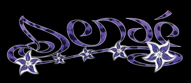
I made a logo for a friend she wants to make stickers out of it to hand out at her shows. I like the general feel of it but something is still a little bit off to me. Please help me figure it out. I know I can trust loganscene to give me the blunt obvious and cruel truth that I need to hear. Thanks for being assholes. It's really useful in the right circumstances.  |
|
|
|
Post by ~~sLuGsTaRr~~ on Apr 22, 2009 14:01:43 GMT -7
The purple with the black background is a little off to me. I think it needs a little more contrast between those two colors.
|
|
|
|
Post by jonzey on Apr 22, 2009 14:48:59 GMT -7
How do you pronounce her name? I think it is pronounced seh-NAY but the accent over the "e" is throwing me for a loop. Or is the first letter a "j"....?
Besides my not knowing how to pronounce her name, the only critisism I can offer on the design is that the flowers don't work with the lettering. Either take out the flowers and leave the text or change the flowers to have the same black spots that the letters have. My vote would be for the prior. I think the flowers make it a little convoluted.
|
|
|
|
Post by secondhand on Apr 22, 2009 22:59:00 GMT -7
Thanks for being assholes. It's really useful in the right circumstances. This made me laugh. Things I like: How the word Flows aesthetically. It has a girl theme (which what I think you are going for) I like the color purple that was used. Things that I would change if I was the artist: First off if it will be a sticker, USUALLY the Gaussian blur/Glow around the flowers is hard to reproduce and make it look well (without the stick just being a square/rectangle) so I would simplify it a little. Other things - there are 2-3 ways to make stickers and depending on how it is done I would design for that method. ex. : if you are going to do the full color purple fading to lighter purple, then that means you will probably need some printing done to achieve it and in that case I would get a little more colorful with the logo, change the background from black or eliminate the black and make it fade to clear/transparent. If you are going to screen print or cut vinyl to get your outcome, I would SIMPLIFY SIMPLIFY SIMPLIFY the shading etc. I personally like outlines to have some 'character' one way to achieve that would be printing out the logo and then tracing it with some velum scanning it back in and then live tracing (convert to vector) it. I would also make them a tich thicker. Last asshole comment: The 'flowyness' that I like about it doesn't seem to match the 'flowyness' of the flowers. the text could be a little more sleek and the bezier curves could be tweaked to have some of the angles match more. But those are a lot of the thing that are usually wrong with my designs as well. Good Luck Jon, over all I think it looks great, just needs a few minor tweaks. Your resident Asshole Second Hand |
|
|
|
Post by secondhand on Apr 22, 2009 23:01:21 GMT -7
You try to understand that last bit of that post, but I meant my designs often have curve issues.
|
|
jon
Ghandi

Posts: 1,334
|
Post by jon on Apr 22, 2009 23:33:57 GMT -7
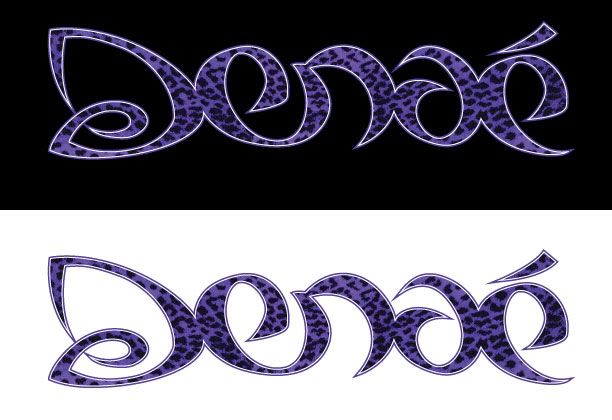
I'm surprised that no one has been assholish at all. All very helpful. I will post the revision in a few. I decided to drop the flowers. Good point about the gausian blur. Also the name is Denaé but everyone I showed said the d looked like an s. It's funny the things I don't see after a couple hours of running with an idea.
thanks everyone
|
|
jon
Ghandi

Posts: 1,334
|
Post by jon on Apr 23, 2009 0:25:03 GMT -7
Ok here is the revision  |
|
|
|
Post by Morty on Apr 23, 2009 8:53:44 GMT -7
I like the new version. I could still include a flower or two at the end of the worded if you wanted to add a little flare to it. The purple with the black.. that leopard thing. I dunno.. I think it's distracting to the design. What would a solid purple look like? And as for the hue of purple, try taking a little blue out, and add more red. So it's more pinkish purple. Unless she specifically wants that cold blue-purple look. That color just looks a little gothic or something.
|
|
|
|
Post by Morty on Apr 23, 2009 8:54:30 GMT -7
Also, I liked the little line at the bottom of the word you had going before. It tied it all together nicely.
|
|
|
|
Post by ~~sLuGsTaRr~~ on Apr 23, 2009 10:10:05 GMT -7
Yeah I liked the line at the bottom. Is the girl really set on the color purple? If she is, something I like to do is, google color palettes, just to find out how I can add more color and contrast to the design. I think it needs more color, especially in the black. I think the design works well, but the colors make it look a little local, for lack of a better word.
|
|
jon
Ghandi

Posts: 1,334
|
Post by jon on Apr 23, 2009 11:46:13 GMT -7
Nice input everyone. This is so helpful since I don't get out enough to get a real critique and I'm still learning. I really appreciate it.
She was set on purple leopard on a black background but I will brighten up the color. She also wants a red and a green version. I agree that the line needs to come back.
Slugger, Your trumpet on Masons cd add so much. Good job!
|
|
|
|
Post by Morty on Apr 23, 2009 13:21:44 GMT -7
She was set on purple leopard on a black background but I will brighten up the color. She also wants a red and a green version. I agree that the line needs to come back. Ah! The classic shitty-idea-from-the-client which they MUST have. Gotta love it! Welcome to graphic design in Cache Valley. |
|
|
|
Post by regina on Apr 23, 2009 13:22:34 GMT -7
any type of design anywhere, isn't it?
|
|
jon
Ghandi

Posts: 1,334
|
Post by jon on Apr 23, 2009 13:25:50 GMT -7
Regina, you are correct! She is from Las Vegas. My brother in Dallas complains about the same type of thing.
|
|
|
|
Post by Morty on Apr 23, 2009 14:06:28 GMT -7
I suppose you're right. I've only done design work here, so I can't speak for elsewhere.
|
|